Features & News
End of Year 2014: Best Visuals
December 17, 2014, Author: The TIMJ Team

Welcome to the third of eleven daily ‘End of Year’ pieces from TIMJ, where in each, we discuss our favourite things of 2014 from carefully selected categories.
Next up is ‘Best Visuals’. Which game’s graphical prowess has impressed the most this year?
Jade Sayers (Staff Writer) – The Wolf Among Us
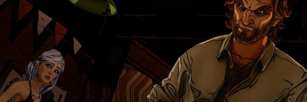
My pick for best visuals goes to The Wolf Among Us. Telltale Games constantly outdo themselves with each of their episodic offerings to the world, but for me The Wolf Among Us is head and shoulders above the rest.
The gritty realism married with the comic book art style fits the detective noire theme perfectly. The reddish colour palette is wonderfully considered and helps contribute to a very moody tone.
Runners Up: Child of Light, Valiant Hearts: The Great War
Josué Cardona (Staff Writer) – Mario Kart 8
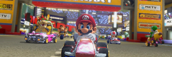
The variety and detail in Mario Kart 8‘s tracks is more satisfying to look at than any other game I’ve played this year. I think that I’m still getting used to seeing Nintendo work its magic in HD, and that has a lot to do with it, but what I’ve enjoyed the most is seeing each of these tracks come alive.
There is a lot going on, including a mix of crazy characters, and it all works perfectly together. Not once have I see something that seemed like it didn’t belong, nor did I ever get taken out of the action because of some visual inconsistency.
It’s a beautiful game and the art style and direction are perfect.
Runners Up: South Park: The Stick of Truth, Child of Light
Jonn Blanchard (Staff Writer) – Assassin’s Creed: Unity
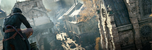
The game had a lot of issues, and I’ve never been a fan of the series but for sheer visuals I’ve got to give 2014 to Assassin’s Creed: Unity. Its gorgeously realised view of Paris during the revolution is nothing short of breathtaking. Yes, naysayers point out that they got some bits wrong, such as having the modern spire on Notre Dame instead of the old wooden one that would have been there during the revolution, but the fact the artists made these decisions so they could produce a more recognisable Paris is, for me, admirable. I love the fact they were willing to use artistic license so we could see the skyline and actually follow it, despite the fact we only have modern Paris as a reference. Yes, it’ll annoy a few people, but that just makes the decision even braver.
As well as the stunning architecture, Unity’s artists have also produced an incredible collection of clothing, with some stunning contrasts between the poor and rich factions. You can easily separate one from the other just by sight. The aristocrats just look wealthy, whilst the poor look dirty and downtrodden; it adds to the atmosphere as a whole and brings another level of realism.
Runners up: Far Cry 4, Alien: Isolation
James Sheppard (Reviews Editor) – InFamous: Second Son
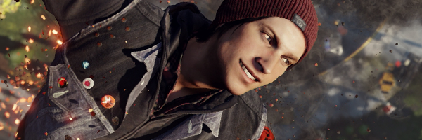
In all honesty, there’s not a lot this year that has absolutely blown me away in the visuals department. I think I’m getting a little spoilt by the high production values we’re seeing right now, and so I’m starting to see beautiful games as the norm, as opposed to the exception. What doesn’t help is that I’m yet to experience some of the most impressive and stylish-looking games of the year, like Far Cry 4, Assassin’s Creed: Unity and Bayonetta 2.
So with a half-hearted shrug, my vote for best visuals of 2014 goes to Infamous: Second Son. Less so for its very well-polished but slightly drab dystopian city, and more so for the wonderful explosions whilst you decimate enemy strongholds, and the fireworks which your super powers emanate.
Close behind are Watch Dogs, for not looking E3-levels of pretty but still good nonetheless; and Mario Kart 8 for blaring out colour and charm by the bucketload.
Runners up: Mario Kart 8, Watch Dogs
Matt Parker (News Editor) – South Park: The Stick of Truth

How many times have you heard ‘wow, it looks just like what you see on the telly!’ when someone wanders into the room whilst you’re playing?
Often, games that try and replicate ‘the real thing’, fall short and plop themselves into the horrendous ‘uncanny valley’. With South Park, we have a game that looks exactly like the show it’s trying to emulate.
This may sound like faint praise when you consider South Park (the show) is trying to look like crude cardboard animation, but this isn’t the case. A huge amount of effort went into getting this game to look, sound and move like the TV show and it’s all the better for it. Amazing.
Runners Up: The Last of Us Remastered, Hohokum
Dan Moore (Staff Writer) – Destiny

It has to be Destiny once again, because say what you will about content level and gameplay, it is absolutely stunning to look at. Each planet has unique look and style, with sky boxes that seem to show something new each and every time you look at them. It belies a universe that has been around, and helps them make it a place you want to explore.
The enemies look great as well, each type having a different look, even among others from the same race. Sure the factions within each race might just be palette swaps, but you can tell the difference between a Hive Knight and a Wizard just by looking. As bad guys go, they are all very cool looking, and I especially like the four armed Fallen. Those guys are bad ass.
Runners Up: Not yet provided
Andy Corrigan (Editor In Chief) – Grand Theft Auto V
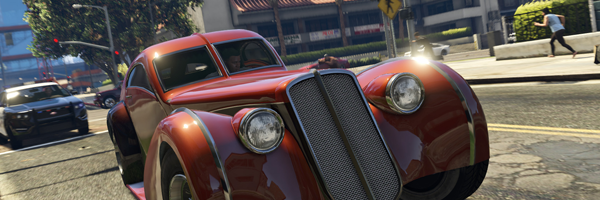
It’s funny how some of the new gen’s best looking games were originally released last year on old tech. While the likes of The Last of Us Remastered and Tomb Raider: The Definitive Edition impressed me visually through improved frame rates and better textures respectively, I think Grand Theft Auto V has benefited the most from this sort of transition.
Los Santos simply looks way better than any world designed natively on new consoles so far; it feels more alive than any world developed solely on new consoles, which is amazing really. Rain or shine, urban, country or desert, the world that Franklin, Michael and Trevor occupy might well be a nasty, seedy and disgusting place, but it sure is a beautiful one.
There’s a particular mission that just sticks with me when I think about just how gorgeous this game is. Trevor tracks a falling plane across the desert on a dirt bike, with the cloudless blue sky and orange desert ahead of him broken only by the grey, imposing smoke of the faltering airliner. Simply jaw-dropping.
Runners Up: Dragon Age: Inquisition, Child of Light
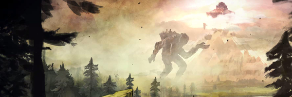
Andy Buick (Features Editor) – Child of Light
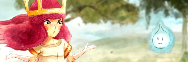
Ubisoft’s Ubiart framework has resulted in some truly lovely looking games, and this year it produced another triumph in the hand-drawn beauty of Child of Light. It may only have been 2D, but the beautiful fairytale storybook graphics fit perfectly, producing a memorable experience.
Runners Up: Infamous: Second Son, Velocity 2X
Matt Best (Staff Writer) – Alien: Isolation
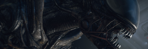
This was a hard one to decide with so many different visual styles seen throughout the year. Child of Light, Valiant Hearts, and CounterSpy all grabbed my attention, but it was Alien: Isolation that was the stand-out.
The Creative Assembly captured the essence of 1970’s space travel perfectly, relying heavily on source material from the original movie. Endless white padded corridors and flickering CRT screens made us feel as if were part of Ridley Scott’s Alien universe. The Sevastopol was also rife with darkened corners and corridors where we would dare not tread through fear of a chance encounter with the faithfully recreated Xenomorph. Sure, it’s not the prettiest game we’ve ever seen, but it’s solid evidence that, when done right, visuals are more than just a backdrop for a story, they can aid in its telling.
Runners Up: Child of Light, Valiant Hearts: The Great War
Jasper Pickering (Staff Writer) – Child of Light
Good graphics, high frame-rates and flashy effects may help in the execution of visual design but they certainly don’t define it. Good visual design has to be not only consistent, but appropriate in its tonality. For me, the best visual design came from Child of Light, a side scrolling RPG developed and published by Ubisoft.
It’s very left-field from the behemoth that is Ubisoft, most well-known for AAA titles such as Far Cry and Assassin’s Creed and yet it still feels like an intimate project, once you ignore the gargantuan cash pile that it stands on.
Child of Light looks and feels like a painting in motion. The backgrounds in the world of Lumuria are both vibrant and desolate when they need to be, and the whole journey feels like a fairy-tale dream. The typical Joseph Campbell seven act structure is beautifully illustrated through the visual depiction of Aurora’s journey in the enchanted land, as she becomes the hero of her own story.
Ubisoft games can feel bloated and committee-designed for lowest-common-denominator audiences; losing their artistic vision in the broad-strokes of their appeal. In this instance, they have made something truly easy on the eyes.
Runners Up: Transistor, The Wolf Among Us
Feature Type: 2014, End of Year | Tagged Alien: Isolation, Assassin's Creed Unity, Child of Light, Destiny, Dragon Age: Inquisition, Far Cry 4, Grand Theft Auto V, inFamous: Second Son, Mario Kart 8, South Park: The Stick of Truth, The Wolf Among Us, Valiant Hearts: The Great War, Velocity 2X, Watch Dogs
